Documentation
Sofax
Thank you so much for purchasing our item
from ThemeForest
Installation
Hello! Welcome to Sofax's official
documentation. Simple,
Flexible, ready to use React Template which
will bring you so
much closer to your end goals. Let’s dive
in.
Prerequisites
React is constructed leveraging
Node.js.
as its foundation. To initiate your
journey with React, it's
essential to have an up-to-date version
of Node.js and
For managing routing within your
React application, the employment of
React Router DOM
is necessary.
Installing Development Environment
We require many packages (dependencies)
to run our site.
Move into /Sofax (project
root) directory and run
command below.
yarn install
After the installation, you should have
a folder named
/node_modules in the
project root directory..
How To Run Development Server
To start our development server run
command below:
yarn dev
Open your browser and visit
http://localhost:5173!.
You should see a page like
below.
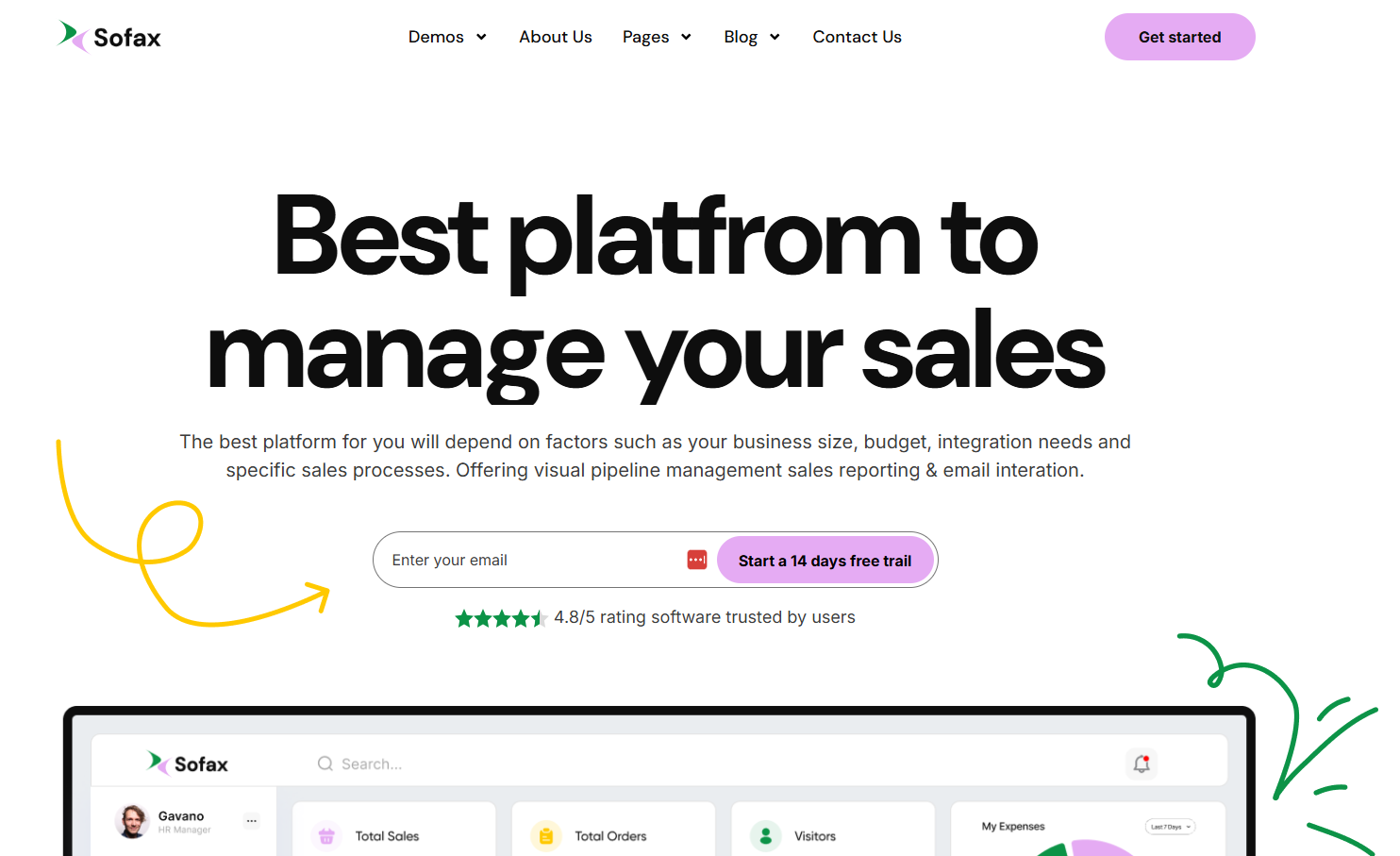
Awesome! You are a
genious. Now
open the code editor and start hacking!
CLI Commands
Some useful commands to work with the
project.
1. yarn dev to Start
development server at
http://localhost:5173
2. yarn build for
Generating production build
3. yarn preview To
serve build files at
http://localhost:4173
File Structure
Follow the steps below to setup your site
template:
-
Unzip the downloaded package and open
the
/Sofax folder to find
all the
template files. You will need to upload
these files to your
hosting web server using FTP or
localhost in order to use it
on your website.
-
Below is the folder structure and needs
to be uploaded to
your website or localhost root
directory:
Sofax-react/src/components
- Component filesSofax-react/src/pages
- All pages-
Sofax-react/src/assets
- Asset files
-
Sofax-react/src/router
- Routing files
Sofax-react/font.js
- Custom FontSofax-react/index.html
- Root file
-
You should upload all or specific React
files as per your
need.
- You are good to go for adding your
content now!
Logo Settings
Replace logo with same name:
You can update the logo by simply replacing
it with a new logo
of the same name.
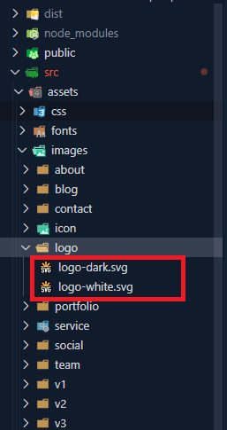
To replace the logo in your project, follow
these simple steps:
1. Navigate to the
public/assets/images/logo
directory within your project.
2. Locate the existing logo file that you
wish to replace. Ensure that the replacement
logo you have matches the same file format
(e.g., PNG, JPG, SVG) and has the same name
as the original logo file.
3. Once you've found the original logo file,
simply replace it with your new logo file.
Make sure to use the same filename to ensure
that the project references the new logo
correctly.
4. After replacing the logo file, any
references to the logo throughout your
project will automatically reflect the
changes, as long as they are referencing the
file by its filename.
5. You may need to restart your development
server or rebuild your project for the
changes to take effect, depending on your
development environment.
6. That's it! You've successfully replaced
the logo in your project.
Layout
Documentation and examples for layout, header and
footer.
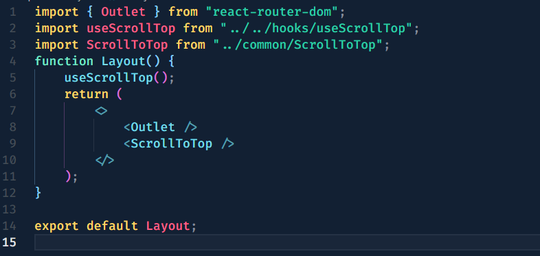
Layout Component:
To Integrate
ScrollToTop
component your need to use
root/main Layout
component. Here's how
you can use the
src/componetns/layout/index.jsx
Layout component
in your project:
To integrate header and footer into
your pages, navigate to the
src/components/layout/multi-page or src/components/layout/one-page
directory.
The LayoutOne.js component
serves as a container for your Home One
content and includes the
src/components/home-one/header/index.jsx
and
src/components/home-one/footer/index.jsx
components. Here's how
you can use the
LayoutOne.js component
in your project:
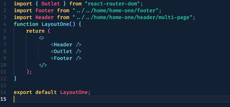
In this code snippet, the
LayoutOne.js component
wraps header, footer and other contents of your
pages, providing a consistent layout
structure. It includes the
src/components/home-one/multi-page/header/ or src/components/home-one/one-page/header/
component at
the top and the
src/components/home-one/footer/
component at
the bottom. You can use this
LayoutOne.js component as
a wrapper for your page content,
ensuring that the header and footer
are displayed consistently across
your application.
This approach facilitates code reuse
and makes it easy to maintain a
unified design across multiple
pages. Simply import and use the
LayoutOne to LayoutThirteen
component in
your router/index.jsx
file to incorporate
the header and footer into your
application layout seamlessly.
Content
Documentation and examples for displaying
typography, table,
image and video and more..
Typography
Documentation and examples for typography,
headings, body
text, lists, and more.
Headings
| Heading |
Example |
<h1></h1>
|
h1. Heading
|
<h2></h2>
|
h2. Heading
|
<h3></h3>
|
h3. Heading
|
<h4></h4>
|
h4. Heading
|
<h5></h5>
|
h5. Heading
|
<h6></h6>
|
h6. Heading
|
Inline Text elements
You can use the mark tag to
highlight text.
This line of text is meant to be
treated as deleted
text.
This line of text is meant to be treated
as no longer
accurate.
This line of text is meant to be
treated as an addition to
the document.
This line of text will render as
underlined
This line of text is meant to be
treated as fine
print.
This line rendered as bold
text.
This line rendered as italicized
text.
<p>You can use the mark tag to <mark>highlight</mark> text.</p>
<p><del>This line of text is meant to be treated as deleted text.</del></p>
<p><s>This line of text is meant to be treated as no longer accurate.</s></p>
<p><ins>This line of text is meant to be treated as an addition to the document.</ins></p>
<p><u>This line of text will render as underlined</u></p>
<p><small>This line of text is meant to be treated as fine print.</small></p>
<p><strong>This line rendered as bold text.</strong></p>
<p><em>This line rendered as italicized text.</em></p>
Icons
The Iconmoon
Icons library is a
popular set of icon components for any
applications. It provides a collection of
icon components that can be easily
integrated into your React projects,
allowing you to add icons to your user
interface without the need for external
image files.
FAQ
A FAQ is a list of frequently asked
questions (FAQs) and
answers on a particular topic.
Yes. You can customize
our items to fit the
needs of
your end product
Royalty free means you
just need to pay for
rights
to use the item once per
end product. You don't
need
to pay additional or
ongoing fees for each
person
who sees or uses it.
Please note that there
may be some limits
placed on
uses under the different
license types available
on
the marketplaces.
The item is what you
purchase from Envato
Market.
The end product is what
you build with that
item.
- You can buy a web
template, add your text
and
images, and use it as
your website.
- You can buy an React
template, convert it to
Next.js, and use it as
your website (but not as
a
stock template for
sale).
Contact through ui8
support
.
Source & Credits
Images:
Fonts:
- Clash Grotesk Semi bold
- Arimo Font
- Bricolage Font
- Playfair Font
- Syne Font
Packages:
- bootstrap 5
- react
- react-dom
- react-router-dom
- react-modal-video
- @ramonak/react-progress-bar
- google-map-react
- react-countup
- react-hook-form
- react-visibility-sensor
- react-countdown
- swiper-react
Changelog
See what's new added, changed, fixed,
improved or updated in
the latest versions.
Version 1.0
Initial Release